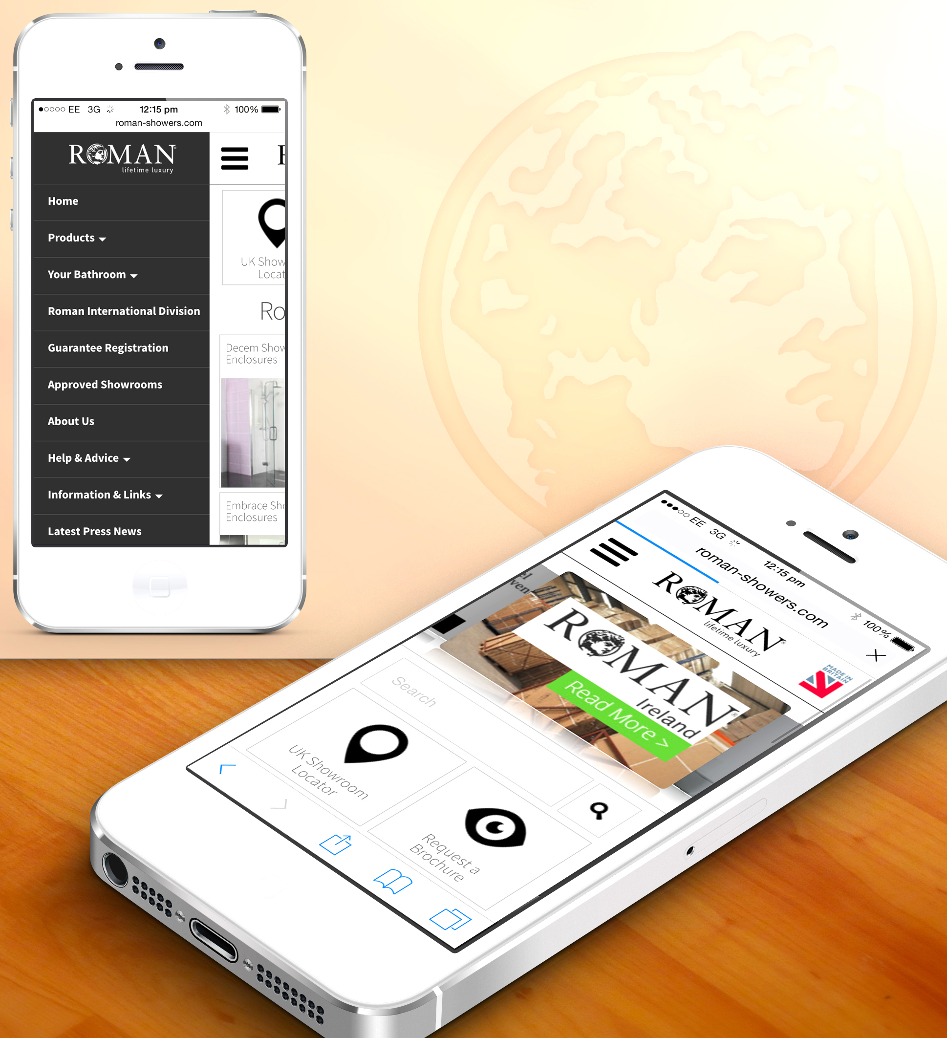
Leading UK Shower Manufacturer, Roman, has redesigned the look and usability of the mobile version of their website (www.roman-showers.com), to respond to the rapidly growing number of people visiting the site through a mobile device. The redesign of the mobile view enhances the users experience to make it extremely straightforward to navigate and improve user friendliness.
Due to the significant increase in people using a mobile phone to browse the website Roman decided to advance their mobile view and improve its usability by enhancing the features and giving it a brand new look.
On entering the mobile site, the user is presented with changing images at the top for a constant fresh look, beneath there is a very visible search box for people to type in their search terms to find what they are looking for with ease and speed. Roman’s showroom locator is a popular feature on their website so it is positioned on the homepage alongside their much used request a brochure button. Followed are the Roman Ranges presented in a modern box design and when clicked they link you straight through to the specific range. The bottom of the page finishes with Roman proudly displaying the Made in Britain Campaign logo followed by all their social media links. All Roman’s social media links are clearly visible at the bottom of every page to ensure that they are clear and easily clickable.
The navigation menu now slides in from the side of the screen to help you find what you’re looking for giving the mobile website a more mobile application feel when browsing through the website. This has dramatically improved accessibility & usability as the menu can be accessed at any time. The menu button is always at the top left of your screen even if you are scrolled right to the bottom of the page and it is displayed on every single page. The menu includes all links from the full website view so that you have access to all areas of the website as you would if you were browsing the full website on a computer screen.
The overall look of the mobile website has been given a modern facelift; it presents a minimalistic look with a sharp white background and bold black icons and text, which improves the customer experience. All buttons and thumbnails are optimised for true accessibility and ease of use on all touch screen mobile devices.
David Osborne, Managing Director of Roman, commented: “As the number of people using a mobile phone to visit our website is constantly increasing, we know it is extremely important that we make their experience as effortless and enjoyable as we can. The aim of our new mobile website is to present a straightforward, simple and modern platform, where people can find what they are looking for quickly and efficiently.”
Aycliffe Company Responds to Growth of Mobiles


